Data Visualization
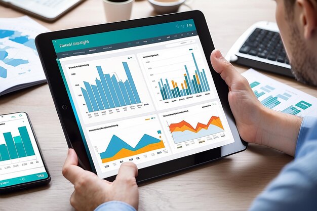
The objective of data visualization is to transform complex datasets into visual representations that are easy to understand, interpret, and derive insights from. Effective data visualization facilitates better decision-making, enhances communication, and uncovers patterns or trends within large datasets.
Key Components:
- Data Preparation
- Identifying Key Metrics
- Choosing Visualization Tools
- Visualization Types
- Color and Design Considerations
- Interactivity
- Scalability
- Accessibility
- Collaboration and Sharing
Data Preparation
Begin by preparing the raw data for visualization. This involves cleaning, aggregating, and structuring the data in a way that is suitable for visualization. Address missing or irrelevant data to ensure accuracy.
Identifying Key Matrics
Define the key metrics and insights that need to be communicated through the visualization. Clearly outline the goals and objectives to guide the visualization process.
Choosing Visualization Tools
Select appropriate data visualization tools based on the nature of the data and the intended audience. This could include tools like Tableau, Power BI, Excel, or custom-developed solutions depending on the complexity of the visualization requirements.
Visualization Types
Choose the right types of visualizations for the data at hand. This may include bar charts, line graphs, pie charts, scatter plots, heatmaps, and more. Different visualization types are suitable for different types of data and insights.
Color and Design Considerations
Pay attention to color choices and design principles to ensure that the visualizations are clear, accessible, and aesthetically pleasing. Consistent use of colors and design elements enhances the overall visual appeal.
Interactivity
Incorporate interactive elements into visualizations to allow users to explore the data on their own. This could involve drill-down features, filters, and tooltips that provide additional context.
Scalability
Ensure that visualizations are scalable and capable of handling large datasets without compromising performance. This is crucial for accommodating data growth over time.
Accessibility
Design visualizations with accessibility in mind, ensuring that they are usable by individuals with diverse needs. Consider color contrasts, font sizes, and alternative text for users with visual impairments.
Collaboration and Sharing
Integrate features that allow users to collaborate and share visualizations easily. This could involve exporting visualizations, embedding them in reports, or sharing links to interactive dashboards.
Blog Posts
Explore our blog for the latest insights on data analytics, Stay informed and discover how our tools can drive smarter decisions and business growth.

Tortor Posuere Consequat Semper Viverra
Elementum eu facilisis sed odio morbi quis commodo odio aenean. In ante metus dictum…

Massa Sapien Faucibus Molestie Feugiat Malesuada
Nunc scelerisque viverra mauris in aliquam sem fringilla ut morbi. Amet mattis vulputate enim…

Accumsan Tortor Posuere Acutare Consequat
Lectus nulla at volutpat diam ut venenatis tellus in. Mi in nulla posuere sollicitudin…